The Idea Behind It
We live in a world that romanticizes hustle — back-to-back meetings, inbox zero, always-on culture. But somewhere between Google Calendar reminders and Slack pings, burnout creeps in. And for people like Rhea, a 26-year-old product manager at a startup, it hits hard. She doesn’t have the time — or mental bandwidth — to sit through a 30-minute therapy session on her phone. She just needs a moment. Something light, stigma-free, and beautifully simple.
That’s where Pause comes in.
The Problem:
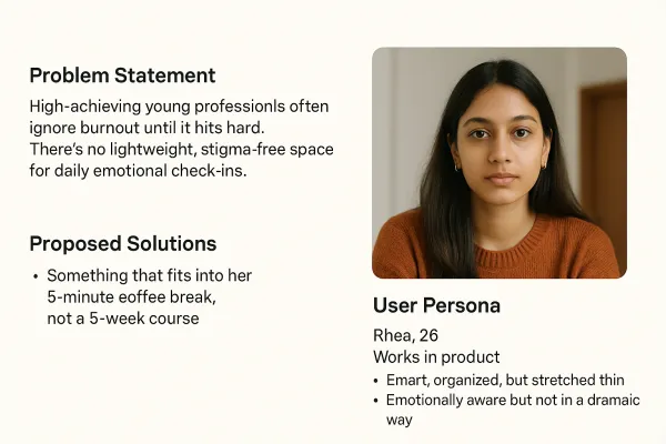
There’s no shortage of mental health apps. But most of them feel clinical, overly structured, or too intense for someone who’s just looking to check in with themselves. High-achieving professionals often delay reflection until it’s too late — mainly because the tools out there are either too heavy or not designed with their lifestyle in mind.
User Persona:
- Rhea, 26, works in product
- Smart, organized, but stretched thin
- She's emotionally aware but not in a dramatic way
- Wants something that fits into her 5-minute coffee break, not a 5-week course
- She hates mental health content that feels like self-help propaganda
Design Philosophy
The core principle was lightness — not just in weight, but in emotional feel. The design had to be:
- Subtle but expressive
- Friendly, not preachy
- Fast, non-distracting, and easy to return to daily
Key Design Decisions
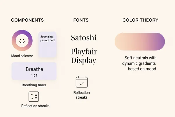
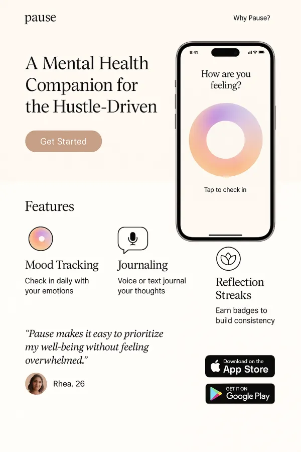
✳️ Components
- Mood Selector: A central ring that responds visually to touch — the more intense the emotion, the stronger the hue shift
- Journaling Cards: Pre-loaded prompts like “What gave you energy today?” — designed to reduce the pressure of a blank page
- Breathing Timer: A soft-loop animation with optional vibration to guide mindful breathing in 60 seconds
- Streak Tracker: Visualized as orbit lines, where each “planet” represents a day you checked in
Fonts
Satoshi: Clean, modern, neutral — used for UI clarity
Playfair Display: Added just enough human warmth for headers and affirmations
Colors
Calm backgrounds: Pale beige, misty blue, and desaturated green
Gradients that reflect your current mood — warmer tones for joy, cooler for calm, muted for sadness
No bright reds, no harsh contrast — nothing that spikes cortisol
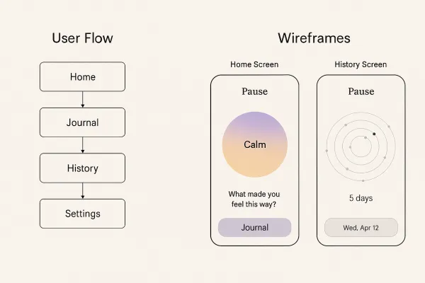
Wireframes & Flow
Home Screen: Center ring (mood input) → Prompt appears based on mood → Option to journal or skip
History: A space-like layout — your reflections orbit around a center point, giving a visual sense of emotional rhythm
Settings: Lets you choose preferred check-in time and enable voice-to-text or quiet mode
✨ Final Touches That Made It Feel Human
Microinteractions: Tapping the mood ring gives a slight vibration and ripple — not loud, just affirming
Voice-to-Text Journaling: Perfect for people who reflect better by speaking
Zen Badges: A soft form of encouragement — you’re not penalized for missing a day, but rewarded when you show up for yourself
Outcome & Reflection
Pause isn’t trying to be your therapist. It’s that quiet friend who just asks, “How are you, really?” once a day and then listens without judgment.
It was designed to fit into your day like brushing your teeth — effortless, daily, and grounding.
This project taught me that design for mental health isn’t about features — it’s about feelings. And if people leave the app feeling just 1% lighter than when they opened it, I’d call that a win.


This is a dummy comment to demonstrate the design. Real comments will be loaded dynamically.